1. What skills have you developed through this module and how effectively do you think you have applied them?
One of the main things that i feel i have developed is my time management, coming off the back of the 100 book brief which was a long project i found i was able to produce a depth of work but in a shorter time, i dont really know why, i just found that i was committing more time to my work and therefore getting more out of it. This however only really applies to the what is a line project and not visual language as a whole. In terms of the vis lang sessions I feel i've learnt more on icons/pictograms, drawing them and making them effective without having a lot or any detail. I also found my perspective drawing skills have vastly improved, after being taught how to do it properly how could i not! I dont think i've applied these skills as much as i could, with drawing which i could have made more use of within what is a line.
2. What approaches to methods of research have you developed and how have they informed your design development process?
I found that research is quite minimal, however i have developed my research by using artist references which i have in the past 'forgot' to do. The artist reference helped me initially to visualize inside my mind what kind of line imagery i wanted to start producing and what not so a good starting point.
3. What strengths can you identify in your work and how have/will you capitalise on these?
I can identify that i can think of initial ideas quickly and produce something of a standard to know if it will work or not, if it can go anywhere like! I'll be capitalizing on this by saving time in future briefs and projects.
i can also identify that i can draw at a reasonable level quickly, within the icons and pictograms specifically, this kind of aiding the first strength.
4. What weaknesses can you identify in your work and how will you address these more fully?
My main weakness from this would be holding onto my work and not losing it, this deeming from an earlier point in the course where my commitment to the course may have been lower as to now. Stay committed!
I can also identify that i became quite stressed by parts of the work, mainly what is a line as i became a bit lost, i intend to address this by keeping a more constant flow of talk with the tutors specifically about my work and to take breaks now and then.
i also find that my work can lack in 'neatness' if i deem it to be off less importance, so i need to stop doing this. i thank you.
5. Identify five things that you will do differently next time and what do you expect to gain from doing these?
1. Take short breaks from work, specially when screen orientated. A more calm, happy me. Not lose sight of what im producing.
2. Think of everything as being important. Have better neat work.
3. Don't lose my work. Having the work.
4. Make more use of perspective drawing and icons/pictograms. Thus developing these skills.
5. Talk to tutors, other students more directly about my work. Assisting in development of my work and also not losing sight of whether my works any good/ effective.
Attendance 4
Punctuality 4
Motivation 3
Commitment 3.5
Quantity of work produced 3.5
Quality of work produced 3.5
Wednesday, 1 April 2009
Ta Darh
After asking a few colleagues around the studio i chose my 'final resolution'...
I printed it out onto A2 matte, i had originally planned to print it on gloss or satin just to give it a certain 'jazzy' appearance, a tad more professional like. Unfortunately they were out of both kind of paper down in the printing dungeon so i settled with matte, it still looks rather lovely jublee though.
{INSERT IMAGE OF RESOLUTION IN CONTEXT(a wall)}
Monday, 30 March 2009
Final Development
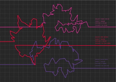
Its getting closer to the deadline and im getting closer to having a final resolution! At this moment in time i'm playing around with the position, layout and size of the graphs, trying to find a solution of the best place for the graph key and the lines themselves. I've chosen to go with a colour palette that represents the ferocity of the movements made, the more red the more ferocious... 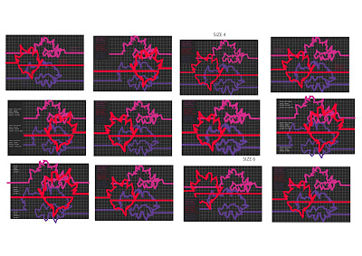
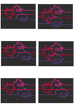
Just experimenting here with the size of both the keys and the lines. Separating the key from the graph itself, playing around trying to find what looks best, im still really not sure, what i do know is that i want the key to be in sync with the lines in term of colour, representing which is which and what not. I also now know that i want the key to be over the graph, so the graph like paper being throughout the canvas.....
I think here i've just got it down to about 6 variations of the design. I want the lines to overlap but i want them to be quite clear and distinct from one another, the colour helping to achieve this, i think i just need to figure out where the keys will be places, Me thinks i shall go away and just ask some people what they think like
Typeface
Just a quick post of the style of typefaces i will be using for the key part of the graphs and what not, 
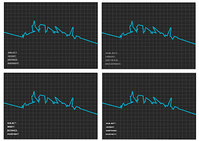
With the context of my work i want to use a complimenting font, typically in a 'pixel' electronic style. Furthermore it is these words that i will most probable be using, stating what the subject matter is, their height, the distance they travelled and a description or name of the movement performed.
Cheeky example of what the layout could be like just to see how the varying fonts suit and what not. Out of the 4 fonts here i think i most prefer the one on bottom right, it suits in terms of style yet is quite understated minimizing focus taken away from the lines themself, its also one of the most legible from the group.
Wednesday, 25 March 2009
long line
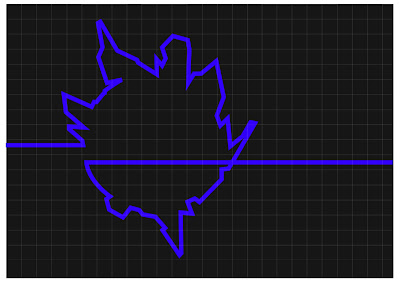
I have mentioned it before but iv done a quick test of what my resolution could look like if i choose to produce one big joined line...
I rather like it but do i like it more than if the three lines were not joined? i will have to wait and see, furthermore it makes a little bit more sense for the lines not to be all joined as they are visualizing different movements!
I like shapes
Maybe a tiny step or a big decision yet to decide, im clearly very indecisive but im not so sure!
But yeah thinking again about how i can make the lines different from one another and bit more interesting. One thing that sticks out in my mind is the circular line, so im going to try the other basic shapes, triangle and a square, which would give me 3 lines, and 3 is the magic number.
oohhhh the possibilities
Cheeky Colour
Another factor of my work i've been trying to progress with is colour. So i've been thinking of diffeent ways i can structure my drawings in the form of colour,
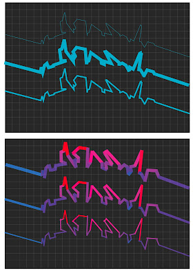
Few initial ideas;
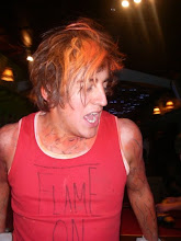
. Refer to the subject in the original photographs and take the colour from what they are wearing.
. Focus on what part of the body the lines are representing, thinking off skin/hair colour
. Consider the type of movement im visualizing and use a colour which relates to the ferocity of the moves, for example blue=calm and red=mental!
From these initial ideas i think there's some potential in the latter, so i tried to produce something according to this rule,
Showing here a simple block colour and the calm to vigerous styles, In all honestly im not too sure on it, i think it looks a bit too jagged/rough maybe i could neaten it up?
But looking at these together the block just seems a little more clear i guess, I'm thinking maybe looking the movements as a whole and if it is busy and a tad mental, be a bright red and if its cool and calm a baby blue?
we'll see...
Subscribe to:
Posts (Atom)