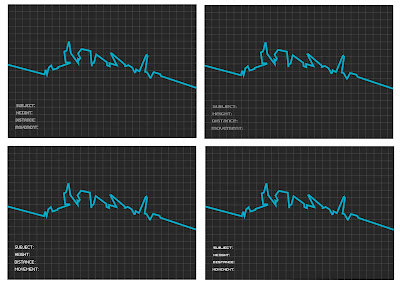
With the context of my work i want to use a complimenting font, typically in a 'pixel' electronic style. Furthermore it is these words that i will most probable be using, stating what the subject matter is, their height, the distance they travelled and a description or name of the movement performed.

Cheeky example of what the layout could be like just to see how the varying fonts suit and what not. Out of the 4 fonts here i think i most prefer the one on bottom right, it suits in terms of style yet is quite understated minimizing focus taken away from the lines themself, its also one of the most legible from the group.

No comments:
Post a Comment