Monday 30 March 2009

Final Development

Its getting closer to the deadline and im getting closer to having a final resolution! At this moment in time i'm playing around with the position, layout and size of the graphs, trying to find a solution of the best place for the graph key and the lines themselves. I've chosen to go with a colour palette that represents the ferocity of the movements made, the more red the more ferocious... 
Just experimenting here with the size of both the keys and the lines. Separating the key from the graph itself, playing around trying to find what looks best, im still really not sure, what i do know is that i want the key to be in sync with the lines in term of colour, representing which is which and what not. I also now know that i want the key to be over the graph, so the graph like paper being throughout the canvas..... 


I think here i've just got it down to about 6 variations of the design. I want the lines to overlap but i want them to be quite clear and distinct from one another, the colour helping to achieve this, i think i just need to figure out where the keys will be places, Me thinks i shall go away and just ask some people what they think like
 

Typeface

Just a quick post of the style of typefaces i will be using for the key part of the graphs and what not, 

With the context of my work i want to use a complimenting font, typically in a 'pixel' electronic style.  Furthermore it is these words that i will most probable be using, stating what the subject matter is, their height, the distance they travelled and a description or name of the movement performed.


Cheeky example of what the layout could be like just to see how the varying fonts suit and what not. Out of the 4 fonts here i think i most prefer the one on bottom right, it suits in terms of style yet is quite understated minimizing focus taken away from the lines themself, its also one of the most legible from the group. 

Wednesday 25 March 2009

long line

I have mentioned it before but iv done a quick test of what my resolution could look like if i choose to produce one big joined line...
I rather like it but do i like it more than if the three lines were not joined? i will have to wait and see, furthermore it makes a little bit more sense for the lines not to be all joined as they are visualizing different movements!

I like shapes

Maybe a tiny step or a big decision yet to decide, im clearly very indecisive but im not so sure! 
But yeah thinking again about how i can make the lines different from one another and bit more interesting. One thing that sticks out in my mind is the circular line, so im going to try the other basic shapes, triangle and a square, which would give me 3 lines, and 3 is the magic number. 

oohhhh the possibilities 

Cheeky Colour

Another factor of my work i've been trying to progress with is colour. So i've been thinking of diffeent ways i can structure my drawings in the form of colour, 
Few initial ideas;

. Refer to the subject in the original photographs and take the colour from what they are wearing.

. Focus on what part of the body the lines are representing, thinking off skin/hair colour

. Consider the type of movement im visualizing and use a colour which relates to the ferocity of the moves, for example blue=calm and red=mental!

From these initial ideas i think there's some potential in the latter, so i tried to produce something according to this rule, 

Showing here a simple block colour and the calm to vigerous styles, In all honestly im not too sure on it, i think it looks a bit too jagged/rough maybe i could neaten it up? 
But looking at these together the block just seems a little more clear i guess, I'm thinking maybe looking the movements as a whole and if it is busy and a tad mental, be a bright red and if its cool and calm a baby blue?
we'll see...

i heart graphs.

Moving on with the new idea of making my drawings into visual information i've had a little play with making some graph layouts etc 
I will be getting some images from the book Data Flow up onto the blog hopefully in the next few days but for now...


So just seeing the difference between a graph with more points and one with less and difference in basic stock colour. 
Out of the graphs here im starting to prefer the faded black with feint white graph lines, with the black not being overlly dominant and also with the lines being less 'in your face' it leaves the drawing as centre of focus which is what i want and overall makes it easier on the eyes than some of the other ones.

Tuesday 24 March 2009

Cheeky development,

As of late i've been trying to find ways to make the drawings that iv been producing a bit more interesting and to also start closing on what i can actually hand in and say is my final resolution from the project. Something more than just design sheets. 
Looking back at the drawings and really thinking of what they are, essentially they are a means of graphically documenting information, concentrating on things such as position, distance, height etc! 
So briefly talking about it and having a cheeky look at the book, Data Flow, merely to get an idea of how information like this can be depicted. 
I also think if i can create a very 'proper' clean way of 'visualising' my information it would be pretty humerous as my information is just my friends making retarded movements in front of a wall. 
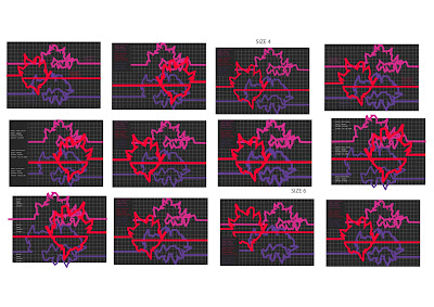
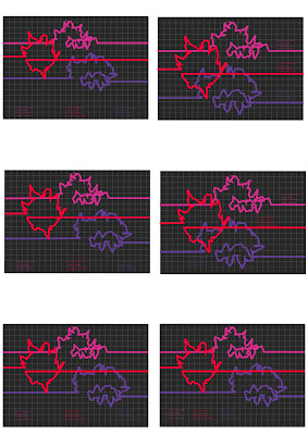
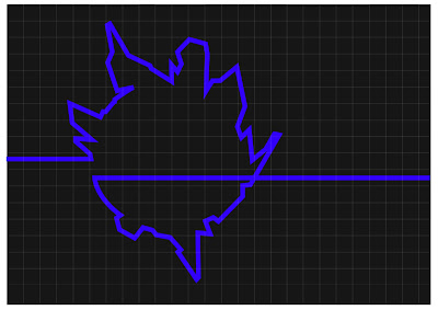
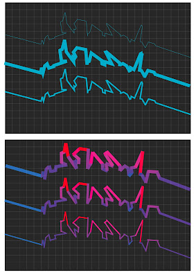
An initial idea i've had after looking at Data Flow is to place my line drawings on top of a graph of some sort...


Ending up with something looking like...


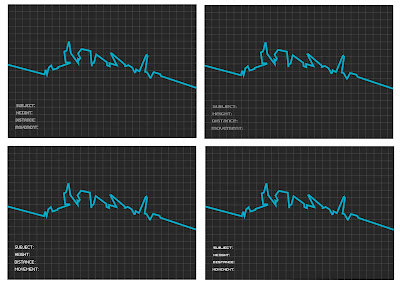
Here i think im on to something, definitely in terms of putting my drawings into some sort of context and a way of producing a final resolution/s. What i think this leads to is thinking about actually trying to get stats/facts from my drawings or just cheating and making them up, things like the distance travelled, a description of the movement;

Subject: Marco Rouge Redhead
Distance: 6.4 metres 
Movement: Subject was found depicting the journey of a legless shrew 

Again bringing in a subtle case of humour, something a bit..hmmmm absurd? 
I think if i can make it fit in with this graph style, altogether it would become something of a resolution. 
 

size?

Throughout this brief i've been planning to really increase the images to a large size, aiming for something in metres, unfortunately as of yet i just haven't been able to get round to doing so, however with this in the back of my mind i attempted to create the feel of something large by putting the sheets together with the line drawings on them joining...


Not shown perfectly here but you get the jist. Talking in terms on a final resolution, this may work quite well, something that say folds or rolls out to this one big connected line, so not only being this obvious line but furthermore showing a sequence of events from the photos i have taken. On the other hand there is still much to play around with as they do still look rather plain. average?

more lines please,

Aswell as moving forward in terms with secondary to primary sources my drawings have started to take a turn for the better and no longer am i drowning in a sea of lost! 


After talking to amberino' and by talking i mean moaning, she told me to draw a circle with the line and i did, it makes it a lot more interesting and exciting to look at than just the normal straight line. Furthermore the use of colour makes it much more eye catching, vibrant etc!


Monday 23 March 2009

going further...

Up until this point i've been making my drawn images from secondary sources, so to move on and give myself a bit more control on the kind of line i will end up producing i have taken a few of my own photos.
With this decision coming quite late on i needed something quick to document with a camera, so instead of skating or bmx-ing i got some chums to, how i describe as 'dancing like a mentalist on meth' in front of a white wall!
these are the results...


They came out to be pretty funny tbf, now i just need to start creating some drawings from these.

Back to the Research...

I've only just learnt how to post videos, rook fo life!
Here's just a couple i found during the whole research phase for the project, enjoy...


This is a vid from last year, Its the first part to a snowboarding short film from Special Blend, although snowboarding based the intro to the film is primo' for lines and stuff! 


This clearly doesn't need explaining...


more to come shortly.

What is a line...

Of late i've been playing and experimenting with producing lines and shapes from sequence photography, focusing on skateboarding, following the journey the rider takes. 

The process i've been trying out is to firstly trace the photos of the rider into one line, from here tracing again to make marks where parts of his body are. From here I've tried to keep the shape of the body quite evident and also a very exaggerated image which emphasizes certain parts of the body...


I like what im starting to produce, Some have come out looking quite slick, however i need to start including colour and to also think of a way that i am going to present them in, 
what context do i need to put them in?

Another Direction, update

So this secret thing i was doing, basically for a just under a week i did my best to annoy my friend and ginger flat mate, Marc Redhead. 
I documented my actions and what consequences came from this! 
I came up with some interesting ways to pester the little bastard and he essentially just became violent.
I did my best to mess with Marc in a range of ways;

Prank calls, pretended to be some random cockney looking for bill. 

Taped ski's to his door.

Put all his food in bags and hide them in different flats. 

general bursts of violence against him, maybe id throw something, hit him in the head! 

Unfortunately one day at uni Marc found what i had been doing by looking in my sketchbook, so i thought id stop as he'd just start to ignore me. 

What is a line... Another Direction

A line is a direction another line is another direction.
But i didn't actually mean that.
Aswell as looking at sequence photography i wanted to look into the idea of a line being a connected series of events/actions in the form of the consequences of these events and what not. I guess simply, a story.
This happened and because of that this thing happened. The idea of action and consequence.
I am as we speak undergoing an experiment, but its top secret, well for the moment it is. For now its under wraps.
Basically i thought id look at plots for big TV dramas, like 24, Lost and Prison Break. As these are based on the notion of action, then the action being the consequence of that action. Often being dragged out for far too long.


looking firstly at Lost, the general plot behind this waste of time is a plane crashes somewhere in the south pacific, the survivors end up on this mysterious island. Straight away the premise has an action and consequence,
Action; plane crashes
Consequence: survivors left on remote island
the programme continues to unfold, giving us more actions from the island and survivors, both in present day and the past of the characters, which in turn confuses the whole situation as the consequences are vast and awfully long winded.
Can a line be referred to as action and consequence?
How can i visualise this?
Can i use TV dramas like lost as examples to produce visually?

....i know nothin!

A Connected Series of Events, Actions or Development

So my first post on this project, out of the sentences i chose to use, ' A connected series of events, actions or developments' ,
With this i primarily plan to look into sequence photography, focusing on skateboarding and snowboarding. This being an easy choice as I'm interested in the sports and have a cheeky pile of magazines which has a good selection of sequence photography in them. I also plan to look at this idea of a connected series of events, actions etc in the form of TV dramas, like 24, prison break, which tend to be long winded events which consequences lead to other 'exciting' events.


Here's just an example of the kind of images iv began to collect, with these I'm planning to mess around with tracing and exaggerating the lines made from the detail in the photos, when i get somewhere interesting I'll get some images up, brb...

Alright so i've been away and drawn and messed around with some stuff so far i reckon this is the most interesting out of what i've done; 
What i did here was to draw a line from every position the riders deck was in, joined them all up and then created this 3d model thing, with doing this i try to add certain shapes that the riders body makes within certain parts of the sequence and exaggerate these in the form of geometric shapes. Also its just a line drawing innit, so works two ways for the brief i guess.


On the topic of skate/snowboarding i thought id post this video which is a bit fancy with lines and what not! However this box thing doesn't let me copy and paste things so il just put the website down,

http://www.youtube.com/watch?v=7C-Yd_Gs7as


A helpful artist reference for the kind of imagery I'm producing and looking to create is Boris Tellegen, otherwise known as Delta,


I'm such a fan of Delta's work, the three above are actually 3D wooden structures, which he then paints onto creating much more depth and creates the appearance of a very technical structure. The relation between these and the imagery i have begun to create is the use of geometric shapes and the whole exaggeration of form, turning 2D to 3D and what not. Also the intricate and complex aesthetic of the pieces is something i want to try and achieve with my drawings.